I think this project i have managed my time wel, my final piece is fully complete and considering i have never produced work of this type before i am pretty pleased with the outcome. I think my coasters and placemats do lack in the terms of tidyness but i was having major difficulty with the laser cutter and finding the exact material i wanted, so i had to find a substitute which didnt work quite as wel as i expected.
In future i think i could maybe experiment more and find more than just one material or an alternative that works just as wel so that i have something to fall back on incase it fails.

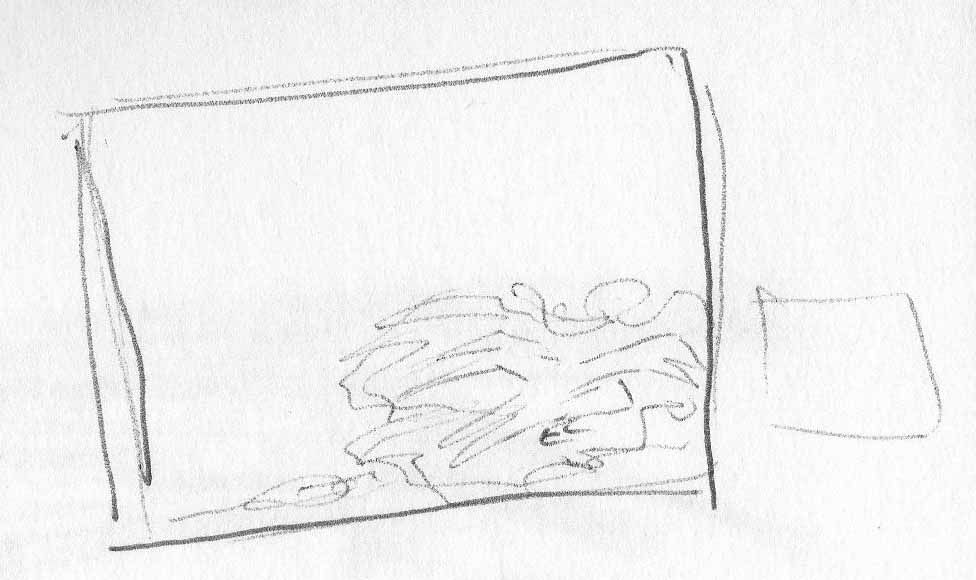
Monday, 21 March 2011
Coasters and Placemats in Use


These are my coasters and placemats shown in use, as they would look with plates, cups and cutlery placed correctly.
Saturday, 19 March 2011
Development

After mounting my print onto my chosen green card, i mounted them both onto my wooden coaster i used a clear, strong all purpose glue to do this. Once it was dry i dotted the same glue into the corners of dry point acetate and covered the top of my design to avoid anything rubbing the fabric away. To finish it off i added a grip material to the bottom so it doesnt slip when in use.
Development


As my laser cut cotton wasnt stronge enough to remain on its own, iv had to go in soearch of a colour card to mount my work to, not only to strengthen it but also to be seen through the laser cut areas (leaves). Green seemed appropriate but also worked well with the brown and blue being used in my design already. I managed to narrow my choices down to three different shades, being these three.
top left; the colour is a very dull shade of green and seems appropriate considering the theme but perhaps a bit too light?
top right; a better shade, alot darker suits the theme.
bottom; very bright grass green, contrasts with my work, is this what im looking for?
Thursday, 17 March 2011
Final Piece


These (my coasters) are images of how the lino combined with the laser cut frail cotton turned out, the first print, as you can see, did exactly what i imagined it would do and tore out a large area of my work. The second one was done in exactly the same way only with more care. After seeing how delicated the prints are i think i will need to not only mount them onto card for more strength but also cover them in acetate or glass as a reality check, if they were to be used as coasters and placemats they wouldnt last very long at all.
Final Piece

Another cut was done using the calico setting but arranging my design so that half of the leaves were engraved, the other half cut so that i got a variety of textures. Im not overwhelmed by the outcome but time is getting tight and the laser cutter is hard to get to, so to avoid my design freying of ruining further i have thought about using card beneath it to sturdy it a little, my only concern which is quite major is that when i use the lino to print onto this im afraid it will take my design with it because of how delicate it is. Iv cut a few of each of the coasters and placemats so i can test some before making final decisions.
Final Piece


These are my attempts at Laser Cutting for my final coasters and placemats, i found a cotton material in a dark brown i laser cut my design onto paper first and it appeared to work wel apart from having to delete a few doubled layers. I put the cotton into the laser cutting machine and started the cut. I changed the material setting to light cotton before hand and the first example here is how it turned out. The laser cutter barely engraved into the fabric even though it was set to cut-through, so i changed the settings to calico because its a slightly heavier fabric than cotton. The second image here is my calico-set laser cut cotton, it cut through far too much making the cotton frey and the design began to fall apart, this left me in a bit of a situation considering these are the only settings even close to what i needed.
Sunday, 13 March 2011
Final Placemat Design

This is my chosen idea for the placemats, iv chose to stick with my coaster idea but extended the leaves out across the printing surface more, as i have more room to fill. iv also enlarged it slightly. It will have all the same colours and be laser cut all the same as the coaster but will measure to 19.7cm X 19.7cm and the design, as iv already mentioned, is slightly more exaggerated.
Final Coaster Design

This is my final idea/design for my coaster, portrayed as basic as possible so that it was quick to draw and easy to understand.
The top layer shows what would be the laser cut area of leaves onto the lino printed crow (cross hatched trace beneath it) although this of course will all be merged into the same layer of my design. Made from cotton either dark brown or cream printed with either dark blue or black ink, possibly even both...

The second picture here is basically a non-slip material which i will use as the base of my coaster. Depending on the width of the entire thing when it's placed together will determine weather i put a light weight card between the layers to make it slighly more rigid.
The size will be 8.5cm X 8.5cm, and my design will fit quite central onto this small area.

I also came across this wooden framed coaster base which i thought my design would look quite nice mounted inside. Its alot smaller than what i want my final design to be, but i also found a larger one like this which i could use for the placemat.
Thoughts So Far...
For lino Printing; Linen and Velvet seemed to print best. Cotton was ok but maybe needed more work to get the perfect print. Colour wise I liked both black onto the cream colour of the linen and the blue onto the dark brown velvet, the effect could perhaps appear different when printed onto cotton so as of yet the colour is undecided.
For laser cutting; cotton definitely gave the best result, but I do think the tile was effective.
As for Dry Point; the lighter weight papers appeared to work better, and the orange was most visually appealing but I don’t think I will use this technique.
To conclude, if I can get a well working Lino Print onto cotton it would definitely be the best working material as of yet. I decided earlier that laser cutting then lino printing would make it easier to line the two processes up.
Thumbnail 4

This is basically my current design multiplied on the placemat to create a tiled effect. I think it would be far too over crowded and the laser cut leaves would all merge together.
Thumbnail 3

This thumbnail is quite basic, its my current design being used on both the coaster and placemat, only the design on the placemat has been enlarged to fill more of the area. I like it because it fits with any time constraints as i purley have to stretch the design on photoshop and its done and it would never be identified as not matching the coaster or being a set.
Thumbnail 2

This second thumbnail is a developement of my first idea, the ability to change how the crow is positioned but use the same techniques and have the placemats and coasters stil be clear and appear to match. I enlarged the crow variation and moved it to the bottom right corner, so the it both fits wel and covers a wider area of the placemat. This would basically be the brow in flight, like the image.
Thumbnail 1

Although i have my idea for my coasters i was unsure how to arrange my design onto a placemat, as the area is alot bigger. I considered shrinking my coaster design and arranging it into the bottom corner then producing a second crow with the same technique and putting it into the opposite corner at the top.
I like that i could produce a whole collection of kitchen utensils and settings using the same leaf idea but with the crow in a slightly different arrangement, each time. Thinking quite literally though i have to consider time constraints and my current chosen design took me a while to produce originally by hand for use on the laser cutter.
Saturday, 12 March 2011
DryPoints

This print was onto cartridge paper, i did all the right things
+ I got the paper wet then allowed it to dry slightly
+ I rubbed an even amount of ink into the acetate
+ The pressure was the same as the previous prints
But the ink didnt stick to the paper as wel as i would of thought of... i'v found that the heavier the paper the less the ink sticks to it.
I actually think it's quite an effective print even though it didnt work wel, the patchy print looks interesting.
DryPoints

My 3rd and 4th dry points were actually on a lighter weight paper, which is normally used for printing onto. I couldnt leave them to get wet for too long or they just fell apart so they wernt very damp, this made me think originally it wasnt going to work well but infact as you can see they worked extremely wel especially the orange. The black ink looks good against the vibrant orange background, i think the ink was i bit thick as it took a long while to dry and it's a very dark print but it worked wel. The white also worked wel but when i rubbed the ink into the etched area i didnt take all the excess off around the acetate and so it printed some spotty patches onto the page a little.
DryPoints

My first few dry points were a case of getting the amount of ink right and the dampness of the paper perfect. I used sugar paper because i know, through stage 1, that it worked wel. But both of these didnt work very wel the yellow paper was stil too damp and absorbed too much ink until it leaked into the page and the purple paper was too dry so the print didnt print very clear.
Experimenting with Dry Point...

I thought it was important to experiment with other print processes rather than assume they wouldnt work; a close technique, in my view, to lino printing is dry point. Here is my fully scratched and inked up dry point acetate ready for print. I thought about doing the reverse to how i did my lino (Positive/negative) and i scratched onto the acetate in a way that when printed the positive area of the crow would appear.
Friday, 11 March 2011
Tile Laser Cutting

I was very unsure how this was going to turn out, i spoke to a laser cutting technician who said i should set the material to glass and engrave and also change the height of the laser head. I did this and this is my result, i think its very discrete and in some ways beautiful but when the laser cutter engraves onto glass it engraves into the glazed layer, this tile didnt really have a glaze over it so the cutter was literally engraving into the tile surface which was maybe too hard for the laser machine. The design is enhanced a little by some dusty parts getting into the grooves but i think it definately helps brings the crow out more.
Fabric Laser Cutting

This green cut, onto cotton matt velvet fabric also has me sat on the fence. The laser cutter cut right through and the heat didnt fuse any of it together and so certain areas began to fall out. I think it worked quite effectively but after a few minutes of handling it the material began to fall apart even more. It has a "dark" feeling about it and the colour does too, but the falling out areas have gone too extreme and almost ruined it.
The brown material was an attempt to line up both a lino print and a laser cut to see how my idea was going to look. The laser cutter is difficult to line up, it begins a cut from the bottom left corner of the surface its cutting, which is why both techniques arn't in line, but i think it would be a better idea to laser cut first and line the lino print up by hand where i can control it more. I definately dont think this fabric; both material and the print colour, work wel for this design and the cut is too subtle to the point it's almost unnoticeable.
Fabric Laser Cutting

My first laser cut onto fabric was the pink material (cotton), i deleted some of the unwanted extra layers and set the cutter to cut through. The heat of the laser cutter and the kind of fabric formed almost like a hard outlined which fused together the cut out areas, so they remained connected to the material. It worked wel because of this happy accident, when held up to the light i could imagine the design as curtains very well.
My second cut was onto "Brushed Linen Cotton", although i set the laser cutter to cut through it didnt really cut, it was more of a slight engrave. The design came out very subtle, im unsure weather i like it or not because certain aspects of it are effective but it wasnt as i wanted it, but at the same time it was only an experiment and it had an unusual turn out.
LaserCutting

Iv now began to develope my design, using the laser cutter (2nd print process) this is my test cut onto cartridge paper some things i came across while cutting where;
+ I set the material to paper, it needed to be a light weight card setting in order to cut through
+ Some of the leaves contained more than a single layer so were cut again and again, some up to three layers. Because it's a hand drawn piece, i needed to delete some layers. It could have burnt the paper and it took alot longer
Apart from these few cons the cut was quite successful, i think the design is effective and clear, now to try other materials.
Monday, 7 March 2011
Lino Prints

My final lot of prints worked well yet again, im happier about the truffle coloured fabric (velvet) as the blue came out darker over the dark fabric and the design is stil very clear. My only concern is the feel of the materials together; the velvet is very soft and the ink overlay feels as though it may pick off over time.
My last lino print was done using similar colours, i did this because in stage one i produced a foil print with similar colours and it gave a great effect. I think the technique worked well but i definately needed more ink as some areas are uncovered.
Lino Prints

My last Black ink print also worked extremely wel and i very much liked the linen fabric i printed it onto as well, because of the layers and depth of the material the ink didnt cover all areas of the linen, but the happy accident was well done and the print is successfull so im happy.
The second print on this page was done using blue ink, i think the shade of the colour is far too light, it contrasts well with the terracotta coloured 'belgian' linen but i dont like the colours together.
Lino Prints

My second Lino Print came out very well, i printed onto a fabric of two shades of green again with black ink. I used more ink this time and added more height to the print machine before compressing the fabric and my lino. The Print is clear which i am very happy with but the colour of fabric didnt really work well.
Lino Prints


This is my Lino been cut so that the negative area around the crow will be the print and the crow itself will be colourless, allowing the laser cutter to finish the design around it.
My first print was on a soft cotton like fabric which was a fudge colour, i printed over it in black ink. The colours didnt contrast enough therefore making the design slightly illegible.
Final design (to date)

This is my final design to date, using my thumbnails ect and developing them i have so far got to this point and decided i think laser cuting would be approriate to cut out the leaves around the crow, i considered flock or foil as a base, maybe as a background colour or the reverse (positive part of crow) but flock would give relief from the surface which could cause a problem for the laser cutter and i dont get on wel with foil i dont like the shiney effect it gives, i think screen printing is time consuming considering the time constraints. So i moved onto either dry point or lino printing, they are both a quick and easy process but which would be more effective...?
Mood Board

I produced this mood board from free samples of fabric, my reason for creating it was so that i could consider a variety of colours and their relation or lack of relation to darkness. Iv also commented on some of the fabrics for possible future referrence; perhaps if i choose to print on pillows ect.
Developement Continued

Remembering this is not a final design, and not perfected this is a rough idea down on paper how im thinking of portraying darkness. I think the idea fits with the Brief and the time constraints, its a simple but effective idea. I now need to consider what part of interior it will look best on and what colours?
Combining Ideas...?

Through developing ideas iv come to a conclusion that the combination of both Ideas 2 and 3 work wel together. These are just a rough idea not a final piece.
Developing Idea 2

This is basically just me attempting to develope the shape of a crow to find a decent outline, the detail within the crow is a little uninspiring i like the idea of it being entirely black making it a bit more 'darkness' related, possibly like a silhouette.
Developing Idea 3


Whilst researching i came across these lamps, they reminded me of my "shadows" idea and how uninspired i was about it. Although the top lmap works more as a projection than creator of shadows it has the same theory behind it. The bottom lamp is a good example of my idea that i could laser cut shadow imagery, which wouldnt normally look like much more than unusual shapes, onto a lamp and when the light is turned on and the design is shadowed onto a surface like the floor or table ect the laser cut work would make more sense and be more legible as art work.
Idea 3


Another idea which appleaed to me was the thought of shadows being either scary in general or when they appear to form something imaginary, not really there of just something your afraid of to play tricks on your mind. I like this idea more in words than i do when i consider possible outcomes. Because shadows are usually so basic it doesnt leave me with a great area of potential to work with.
Definition
en.wikipedia.org/wiki/Shadow
A shadow is an area where direct light from a light source cannot reach due to obstruction by an object. It occupies all of the space behind an opaque object with light in front of it. The cross section of a shadow is a two-dimensional silhouette, or reverse projection of the object blocking the light.The sun causes many objects to have shadows and at certain times of the day, when the sun is at certain hights, the length of shadows change.
Idea 2


Crows are considered to be the bird of death, this fact appeals to me and so i think i'll look further into it, i think it has alot of potential. As well as this i think they're a beautiful shape espcially the top image, when it spreads out its wings and legs; alot to work with. Layers of screen prints over placemats of coasters could create a goood effect, or foil?
Definition
wiki.answers.com/Q/What_Birds_symbolize_death
"Crows are the birds that bring back the dead from the plane of to dead to the the living plane for wrongful death."
Idea 1


After creating a mind map of ideas related to the theme "Darkness", i picked out a few possibilities which appealed to me. One of these ideas was an eclipse, i like the idea of perhaps showing the stages of an eclipse, maybe a seperate stage on each different part of cuttlery or around the edge of a mirror...
Definition
Dictionary.net
1. To cause the obscuration of; to darken or hide; -- said of a heavenly body; as, the moon eclipses the sun. [1913 Webster]


Wednesday, 2 March 2011


Subscribe to:
Comments (Atom)