Tuesday 8 February 2011

LinoPrinting


Lino Printing
My first attempts at lino printing ended badly, i used a normal kitchen floor tile, it was much harder to cut into and was very thin so i had to be wary of how deep i cut. the first attempt was too wet and the second was too dry....

LaserCutting


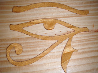
Again, experimenting with more fabrics until i found the best one. I only engraved into the paint covered cotton but cut through on the silky fabric, it work really well and has a very smooth finish. The paint covered fabric didnt really engrave, it marked the material in an unusual way though which was interesting.
Until this point, with laser cutting, i hadnt really considered colour for my symbol. Ancient Egyptians used vibrant, eye catching colours for all of their symbol work so i thought colours like this unusual vibrant yet dirty yellow, and previously patterned with print, blue fabric; were appropriate.

LaserCutting


Experimenting on different materials; sugar paper and calico.
The calico seemed to not cut through completely and was difficult to part from the negative part of the cut.

LaserCutting


Laser Cutting
Laser cutting is for my the quickest process.
Take your design into illustrator
Live trace, expand and save the file
Open up the designn in the laser cutting software
Assign options (cut, engrave) to colours available
And follow instructions to cut
These were my first cuts, on a normaly 3mm card, i kept both the positive and negative parts of the cut, and compared them to the engrave.

DryPoint


After completely rubbing brown ink into my design and putting it through the press another 2 times, this is my final and most preferred dry point print. The colour is even constantly and constrasts well with the background so the print stands out.

DryPoint


By merging 2 colours together, and putting it through the press 2 more times this is my outcome, i put no more yellow ink on from my initial print only the brown. The brown ink is definately more prominant than the yellow.

DryPoint


DryPoint
On my first drypoint i used yellow ink, it came out very bright, on a white background it didnt work so well either. It was difficult to see any imperfections, to overcome this i thought about adding another coloured ink... one that would contrast with the background.

Flock&Foil


This was just me experimenting again, the combination of both flock and foil ended badly as i put the foil on the wrong way before putting it in the heat press.
The two colour foil came out quite wel, very pleased.

Flock&Foil


Here i expermiented with diffrent colours for both the flock and the foil, i used more contrasting colours when it came to the flock so i could see the outcome. I much prefer the foil combination though, the difference between the colours is subtle and they blend, giving a nice effect.

Flock&Foil


Basic Flock & Foil
This is a basic example of both flock and foil, using my screen and a gloopey adhesive i screen printed the design onto my surfaces and allowed it to dry before laying the foil, colour up onto the fabric and the flock, flock down onto the calico. I then put it under the heat press, which makes the adhesive sticky again in order to let the flock and foil attach itself to the design. I peeled the flock and foil off and this was my result, not bad for a first try...

ScreenPrinting


Screenprinting
I began my prints by registering everything including both the screen and my design on acetate, by using small bits of masking tape, i lined it up.
I did my first screenprint onto a thin paper to text the screen, i then screen printed again onto calico. The calico showed alot of imperfections in either me design of the screen, as you can see by the many ink dots over the print. To overcome this i used parcel tape and taped off any areas where unwanted ink could leak through.
I experimented with other materials like these colourful sections of paper, ripped apart and taped together. It allowed me to see the outcome, of my print, on many different papers at once rather than doing them individually.
It appears to have worked better on the heavier paper (patterned, bottom left) and not so well on the sugar papers and tracing paper.

Christopher Le Brun


Christopher Le Brun (1998)
Woodcuts/ Hand Printers, 3 blocks used per print.
Block Printing is a similar process to Lino printing only used with blocks.
A design is carved, sliced or cut from the lino before it is coated in ink using a roller and printed onto a surface using a specified, heavy printing machine, usually by hand.

Gary Hume


Gary Hume, 3 Young Woman
This image took a total of 15 screens to print.
The design appears simple but the more colours you want to use the more screens need to be exposed with a different area of the design.

Jake & Dinos Chapman, Gillian Wearing


PrintScreening
(skulls and Crossbones) Jake & Dinos Chapman
This Screenprint took a total of 4 screens to print.
(Tshirt prints) Gillian Wearing
Screenprints on fabric
Screenprinting is a technique that uses an extremely fine woven mesh, so that ink can be passed through the desired areas in small amounts and neatly to produce fabulous prints like these.
In order for a design to be put onto a screen in the first place it needs to have a special coating pasted over it and allowed to dry, the design should be printed onto acetate in black and using the apropriate machinery the design is put onto the screen using a UV light, in an all other light tight, vacuumed place.

Jake & Dinos Chapman, Peter Doig


(Top) Jake & Dinos Chapman, The Disasters of War 33
(Bottom) Peter Doig, 8 Rosendale House (1996)
More examples of the dry point process, these prints are in far more deatil to show how effective this technique can be.

Mark Quinn


Mark Quinn (1995) Dry Point
Dry Point is a printmaking technique. With the use of intaglio ink and some phone book, ink is rubbed into the etched areas on a slightly thicker than acetate plastic sheet, excess ink gets rubbed away before the plastic sheet along with a printing surface is rolled through a roller machine, printing the etch onto the surface.

ColourAssociation


Yellow and Black together are often associated with Hazardous, or as a general warning. Did man assign these colours with these meanings, or was it through animal recognition?
This Poison Tree Frog is very small, but its yellow and black skin acts as a defence, or a warning for preditors to stay away, like the attention sign, it alerts us and acts as a warning.
The symbol for Male/Female toilets are easily recognised by anyone, but why blue?
My theory is that blue is quite a hygienic colour and we would all hope that public toilets are hygienic.

Colours&Symbols


Eliot Lipp, Peace Love Weed 3D
The peace symbol originates from the 'Hippy' period during the 1960s, where they wore brightly coloured clothing and accessories. Because of this era colours from this palette, are automatically associated with the peace symbol.
No Smoking
The red part of this symbol alone has become so iconic over the years, the red circle with a line through it has forever been associated with 'STOP'. Often these stop smoking signs have text too, but again it is so iconic is doesnt need it as support.

ColourMeanings


The Tragedy (1903) Pablo Picasso
This was painted throughout Picasso's 'Blue period', he uses a more mellow pallet of cool blues and other numb tones to portray a feeling of 'sadness and dispair'.
Traffic lights
Most people know traffic lights as; Red: Stop, Amber: Get ready, green: Go.
through this these colours have more recently been associated with anger, OK and happy, and people go out to parties called 'Traffic light parties', where Red means taken, Amber means dont mind and Green means single.
Lizard
Animals and their skin colour have been associated with attracting mates, warning off preditors and sometimes their mood.

ColourMeanings


In more Recent years colour has been associated with birth months, feelings, temperatures ECT. My birth month is June, which apparently is associated with the colour; Aspen Gold, standing for radiant, uplifting, energizing, and intellectual.
Sunflowers (1888) Vincent Van Gogh
the colours used in Van Goghs work shows a feeling of 'Hope and Joy', by using warm yellows he has created an energetic image.

ColourWheel


Primary colours: These are pigment colours that cannot be made by mixing other colours. The colours are Red, Yellow and Blue.
Secondary colours: Made by mixing 2 of the 3 primary colours together. These colours are Green, Purple and Orange.
Tertiary colours: These colours are a combination of both primary and secondary colours being mixed together, the names for them would be (E.G) Yellow Green, the mixing of primary colour Yellow and secondary colour Green. There are 6 tertiary colours.
Tints and Shades are also part of a mixing palette only slightly different, you could take anyone of these colours and mix black with it (to make it darker) and it would be a shade, by mixing white (making it lighter) you would get a tint.

Symbols


The Acient Egytians used symbols called Heiroglyphics, it was a formal writing system, they portrayed them in many ways like by painting, carving, printing and somethimes even burning into surfaces even their own skin.
Symbols are also used in music, the treble clef is a beautiful symbol with a calligraphic style to it, in order to be able to print this it would have to be flipped first so it would print the right way.

Symbols


Symbol: Something that represents something else by association, resemblance, or convention.
A printed or written sign used to represent an operation.
Symbols go from Zodiac signs and religion through to symbols that represent an era and chemicals that are hazardous.